• Welcome to the Resident Evil Community Forum!

    We're a group of fans who are passionate about the Resident Evil series and video gaming.

    Register Log in

Resident Evil 3 Remake Comparing re 3 remake map (and more) whit the original

  • Thread starter Deleted member 21244
  • Start date
D

Deleted member 21244

Guest
So i was just looking at the original re 3 downtown map and uptown map and i compared it whit the re 3 remake downtown map, and i realize how ridiculously small the remake map is, the remake map is actually made of two streets and some shop while the original map was huge and explorable and very detailed, and every location was connected whit street between them, like the police station for example was connected whit the other location while in the remake you cannot reach it...

I would also like to compare the other maps (and other things) of the original whit the remake, but for now I ll put the town maps
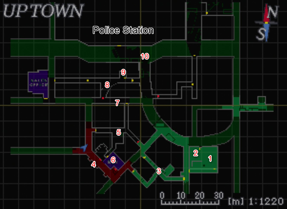
original_3ce04b029d3275eb083717bdf1a3dab1.jpg

1XewGjaALMhxnI8RRrQwtQRVujXH8bI-QUFm4dbOjJMJaymkDlc9OZxVls6V0uY4OsMJ6qYReZ6HHAzodLzLRE2FPW0GrlZtnNXR_K0GQ6I

Here you can see how huge the map was in the original whit both uptown and downtown , we have restaurant, office, garage, raccon main hall, stagla gas station, bar ecc (thee are actually dozens of location to explore) all interconnected between them whit main streets and other little streets , you can also see the police station up on the map
Also every one of that location like the restaurant, the office, the stagla ecc have its own map once you enter them, so that map is actually bigger

And now here the remake lol
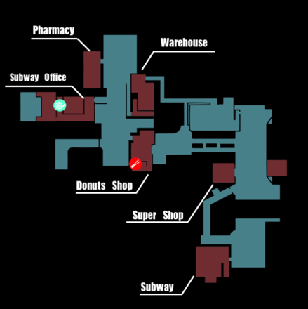
show


Yeah, it's really ridiculously small, THIS MAP IS LAUGHABLE, the map is actually formed by two main street and you have some shop around and most of them are actually the same except for the donuts shop and the farmacy... There is also the power plant on the right part of this map but it's a streight forward location, you just go from point A to B....

The police station is also in the remake but there is no street that lead to it and is zero explorable, you just shoot with Carlos and proceed to the next room
We also have the sewer but it's a pretty straight forward location and was completely ripped of re 2 remake and Infact used the same asset

This make me realize how really disappointing this remake is, not because i want to throw **** on it and on capcom, but really, for as much as i enjoyed this game some months ago, i know realize how bad it is, this map comparison really talk by itself... Capcom should have worked harder on this game
 
Last edited by a moderator:
UniqTeas

G Virus Experiment
I don't know what goes in to set design in modern games. But man, I have so much fun designing location maps for hand drawn games. I wish they had more passion for the overall design!
 
D

Deleted member 21244

Guest
I don't know what goes in to set design in modern games. But man, I have so much fun designing location maps for hand drawn games. I wish they had more passion for the overall design!
They actually put very few passion in the game map, the original re 3 map were really well designed, re 2 remake map was was amazing, it was nearly perfect, every part of the map was interconnected and explorable, you can even go back to each place even after you reached the sewers but in re 3 remake are really poorly designed

redstonestreetstation_3.png


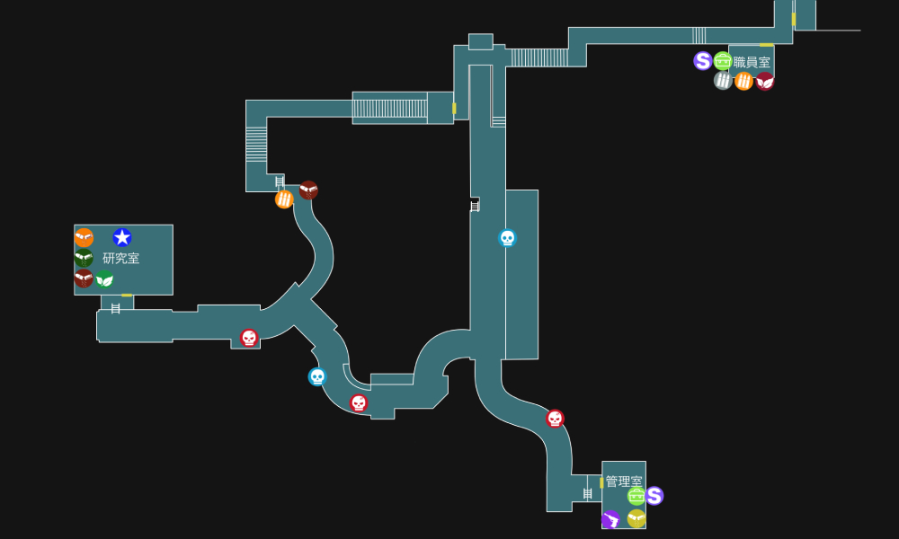
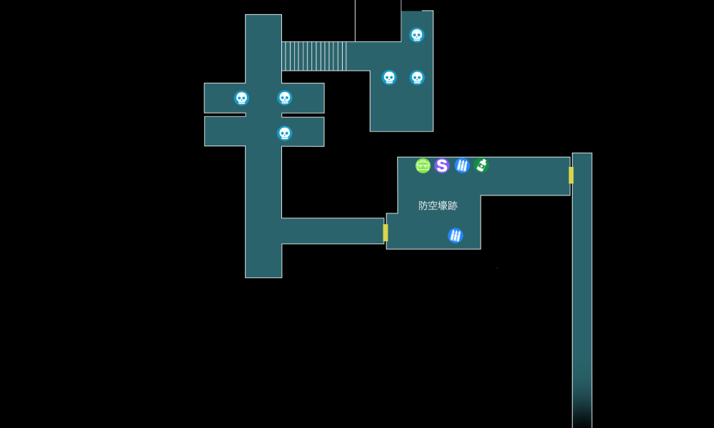
This is the subway from the re 3 remake, it's a straight forward map, just going from point A to B lol

original_949a644b51e1a361a8cdc75ff50fa40f.jpg


Here is the sewer map... Another A to B location
This location where not present in the original so i cannot compare them, but damn

original_e4f11055fbf6da468f788443db42d86e.jpg


clocktower2f.png


clocktower3f_1.png


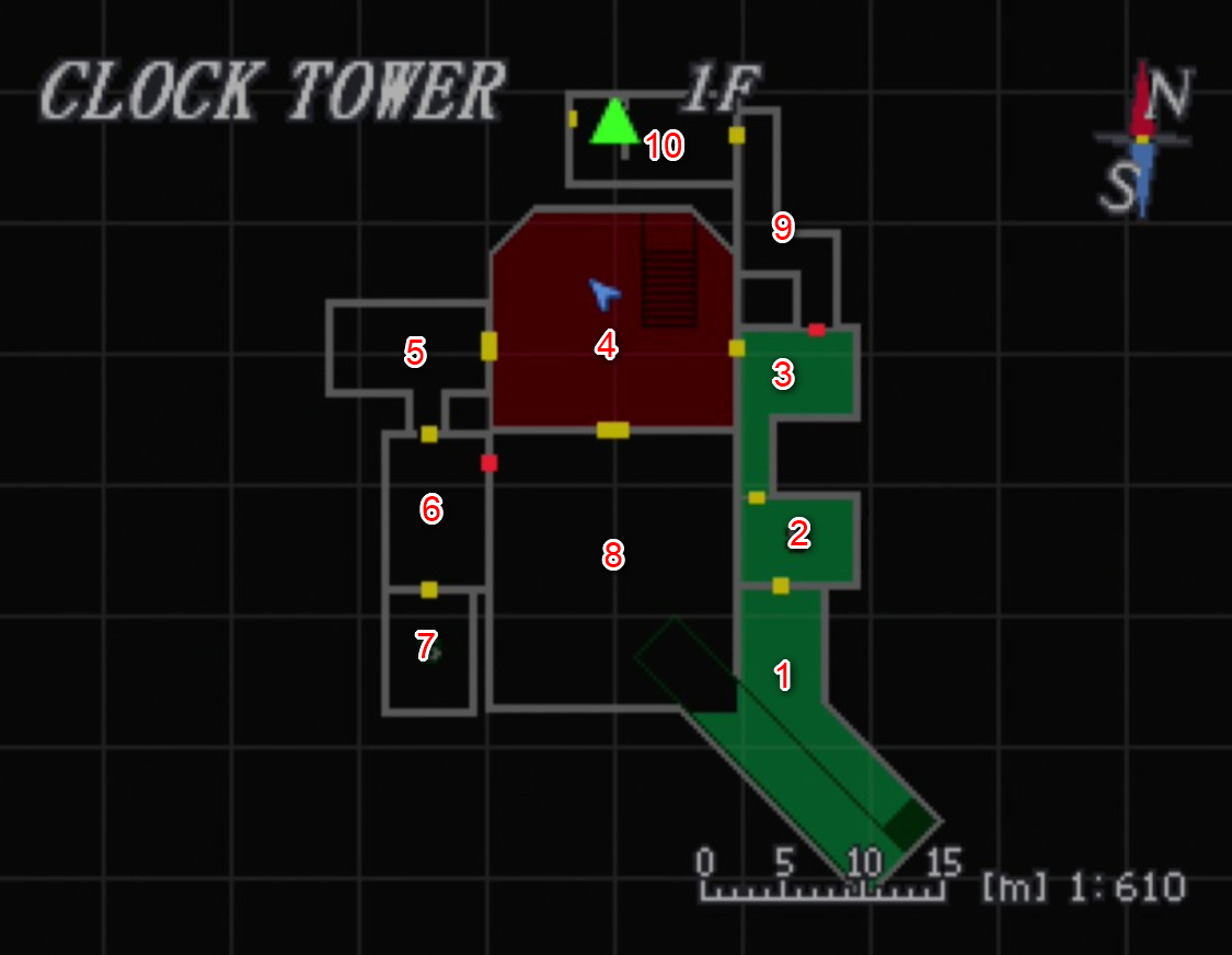
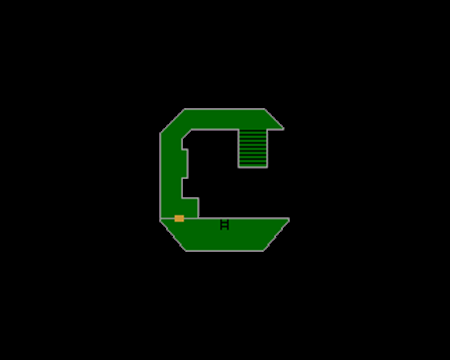
Here is the clock tower in the original, we have actually 3 floor, even if the 2f and 3f are just straight forward it was actually better than not having it at all in the remake, and this whole map was full of beautiful puzzle

After jill was infected, you can access to the street whit Carlos, this street will lead to the hospital, this part was awesome and it also show how interconnected the two are was, you can even go back from the hospital to the clock tower, in the remake carlos just find himself into the hospital... After jill was healed you can head from the clock tower to the park and than to the dead factory... So the park the clock tower and the hospital were linked between them, it was another part of the city poorly showed in the remake

park_4.png


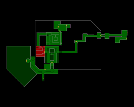
Here is the Park map, we have the street clock tower on the south part of the map near the number 77, and we have the hospital ( whit it's own map) on the left side of the map
Than we have the park on the right side of the map... There was also another map that show the under part of the park


And here the clock tower, the park and the street that connects all This in the remake lol


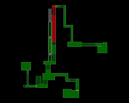
original_5b4e81c2b9a66b4f763168b11b0fd215.jpg


Yeah, just a straight forward map, that lead from the crashed train to nemesis second battle in a circle map lol, than you are right into the hospital whit carlos, who is probably the only map who is better than the original, but I'll leave it to another post
 
D

Deleted member 21244

Guest
This was basically how I felt the first time when playing the game.

The superfast-paced linear structure really killed this remake.
Yeah i think this too now, is actually a poor remake... In my opinion only the story, character and combat were decent but all the rest of the gameplay and things that should make great a re game were pretty mediocre
 

Jonipoon

Professional Sandwich Consumer
The story feels more like it was written for a film adaptation rather than a video game. Very compressed and fast-paced, which usually isn’t something you want to be aiming for as a developer when designing a full game. Perhaps for a DLC, but not for a full game.

There are very few things I genuinely like about this game. Most of the stuff I liked was stuff I enjoyed during my first playthrough, that quickly became less interesting/impressive during second and later playthroughs.

The OG RE3 is still amazing, and I’ll defend it night and day as long as I live. It’s such a shame that the remake didn’t get the treatment it truly deserved...
 
D

Deleted member 21244

Guest
The story feels more like it was written for a film adaptation rather than a video game. Very compressed and fast-paced, which usually isn’t something you want to be aiming for as a developer when designing a full game. Perhaps for a DLC, but not for a full game.

There are very few things I genuinely like about this game. Most of the stuff I liked was stuff I enjoyed during my first playthrough, that quickly became less interesting/impressive during second and later playthroughs.

The OG RE3 is still amazing, and I’ll defend it night and day as long as I live. It’s such a shame that the remake didn’t get the treatment it truly deserved...
Yeah i agree, but since the game was given to Mtwo - inc an unknown developer studios, there is actually not that much to be surprised, they should have given it to a capcom first party instead of giving the development to some unknown team who finished the game in 2 and half years

I can't imagine what they will make whit a re 4 remake since rumor say this team is working on it lol
 

Spikeyroxas

Pencil Artist
Premium
Some Differences between them both

Original
Police station
Clock tower
Grave digger bossfights
Park
Repairing the tram
Dead factory

Remake
Opening sequence
Substation creatures
Sewer
Scaffold nemesis boss fight
Carlos Playable in police station
The hive2

Police station:
Originally Jill only needs to enter the police station for the lockpick I believe (as well as evade nemmy) and only half of the Station is accessible anyway.
In the remake you visit this location with Carlos and the other guy. Again only half of the station is accessible but you gain more story from Carlos and it ties in the events of the second games remake really well so this was a better change imo.

Clock tower:
Whilst this section is missing, so we miss out on the spiders, and few puzzles. This is a small area which doesn't take long and you can say the sewer section in remake, the boss fight on top of the scaffolding and escape from nemmy to the tram replaces this anyway.

Gravedigger boss fights:
Not really much to say about this, they just didn't include these enemies. I guess they thought it was a bit silly?

Park and dead factory:
Story wise it flows better that Carlos takes Jill to the hospital where he finds the cure for her rather than her resting in a chapel in the CT, also by this point they definitely know nicholai is a bad guy. I guess the hive2 replaces these areas though

Repairing tram
The remakes have less puzzles in unfortunately so this a missed section.


All in all even though some sections were removed, other stuff was added in to replace them. They added more story to sections and really build up Jill and Carlos relationship. I think they did a good job on the remake personally and I was happy with it.
 
Last edited:
Top Bottom